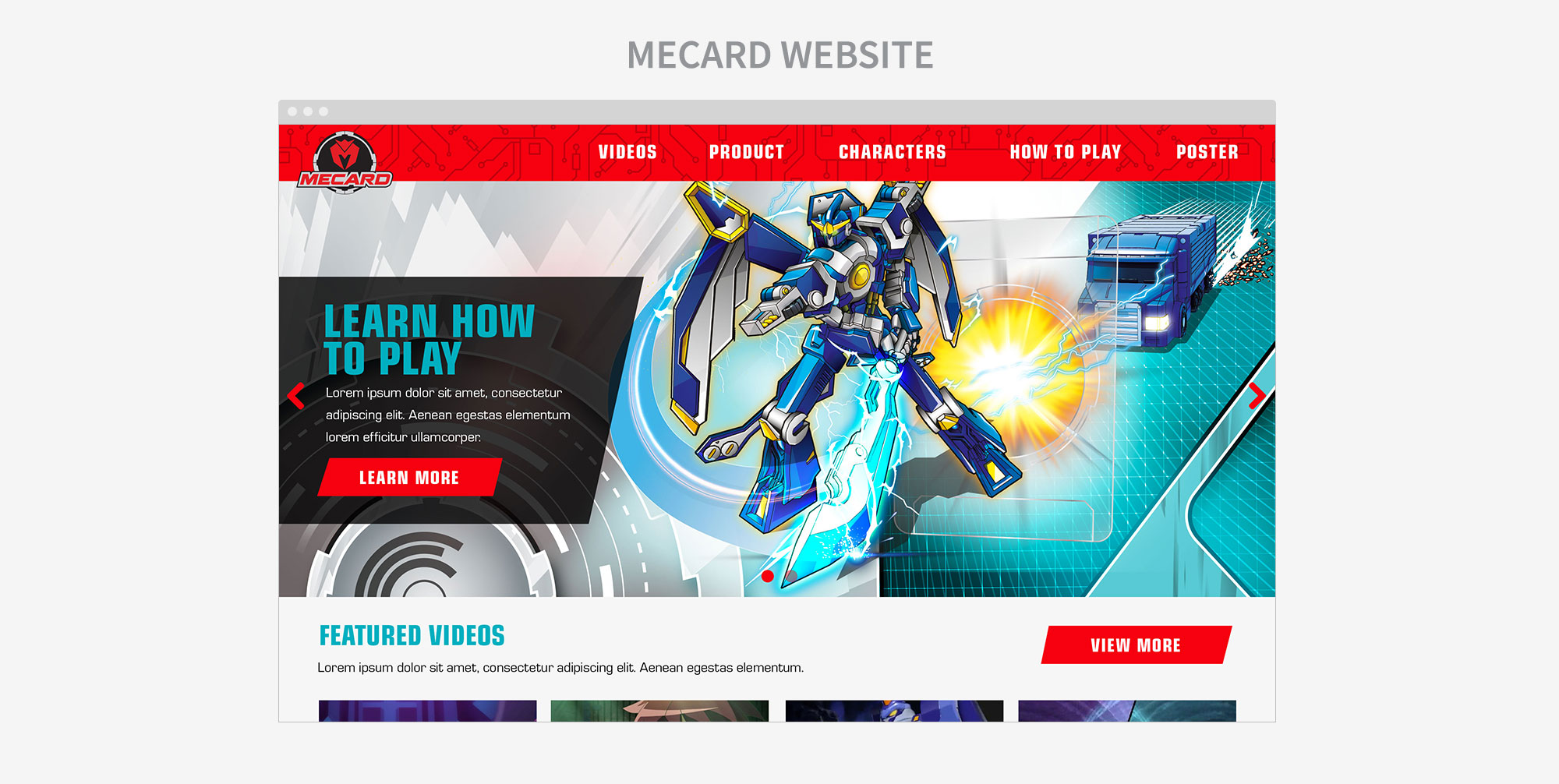


The Mecard toy was launched in March 2018, and with the new toy, Mattel needed a new website. The website goals were to drive awareness of the new brand with content, engage consumers and build fan base through collectability, and to drive conversion. The site had to house the character bios, information on how to play the game, videos, and the product in a child-friendly PDP. Since the user of the website is a kid, everything needed to be easy and designed for kids, from the copy to the colors on the site, while still utilizing the Mecard style guide. The target audience to focus on are boys between 6-9 years old.
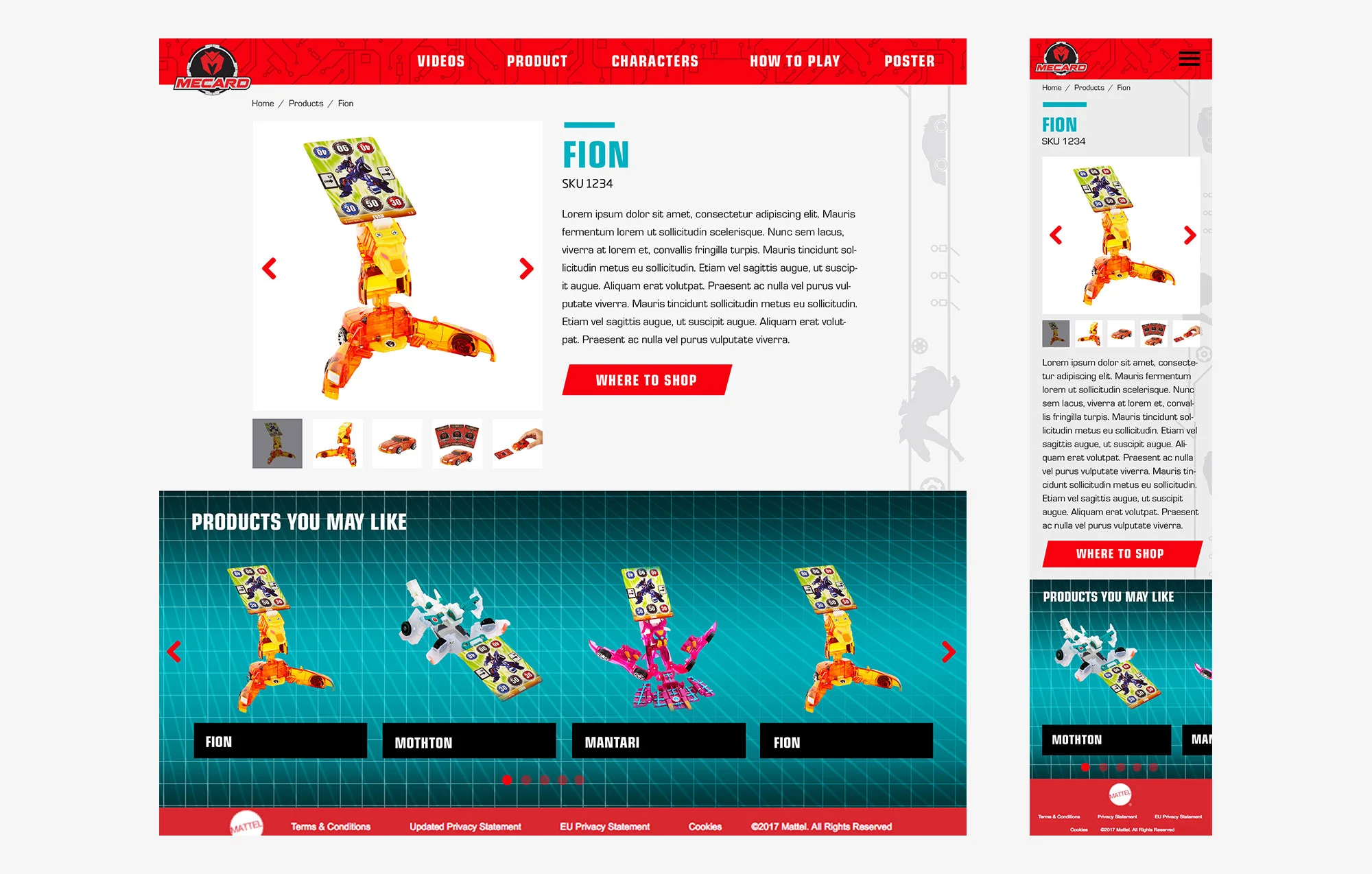
I worked worked closely with Product and the Mecard team throughout this project, from beginning to end. I started with sketches that were brought into higher fidelity wireframes to present to the team. The process of developing the wires involves using the Mattel component library that I helped develop. This library is filled with reusable components that can be used across multiple sites and changed in style based on the website. These components are based on the Mattel website needs. While working on the wires, occasionally you will need more flexibility than the components will allow based on the needs of the project, and new ones can be developed. The Mecard site mostly used components from our library, except for the Filter page which was more involved and the team had more specific needs for this.
Besides the component library, since this website is for older kids, the wires are designed closer to UX for adults with some revisions. The CTAs are still very large and all the text is larger than usual. Kids at this age can read well, hence the site being more wordy with the How To Play page. And kids at this age have better coordination and dexterity skills and can use a mouse and keyboard efficiently, making this website geared for desktop as opposed to tablet which is the need for younger children. The PDP page is just for show since kids aren’t the shoppers, and takes the user to an interstitial modal that acts as a warning that past here the site is for parents.
Once wires were approved, I moved onto design and did some research on other brand’s websites and competitors to get a sense of what the demographic, boys between 6-9, would be interested in. I also studied the style guide and other assets that had been developed for Mecard from the brand. The fully realized comps I put into Invision to create a fully working prototype of the website to present to the team. Once the designed comps were approved, I handed the designs off to the developers with a CSS guide and markup of the files.