

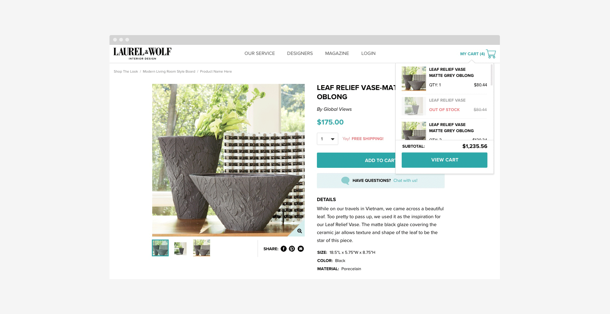
While tech was working on some reconfigurations to the checkout process, we took this opportunity to adjust and redesign the cart and whole checkout flow. We wanted this version to be mobile friendly, simple and easy to navigate, and be standard to a normal ecommerce checkout experience that our clients are used to (since we use Stripe, some of the fields aren’t required but not having them gives our clients insecurity). This project also included a new product detail page, adding a cart icon to our nav with a cart dropdown, and redesigning our orders page.
I worked with product and our stakeholders for the full extent of this project, which was a larger one. I then did some research on checkouts and carts, for desktop and mobile, and found an abundance of visual examples. I reviewed these with our product managers to figure out a direction we wanted to go which included our tech limitations, and then began working in wires and then fully realized comps. Since this project was very focused on mobile, I worked on desktop and mobile at the same time, but really focused on the mobile experience.