


UI/UX | Aspirational homepage versus educational homepage
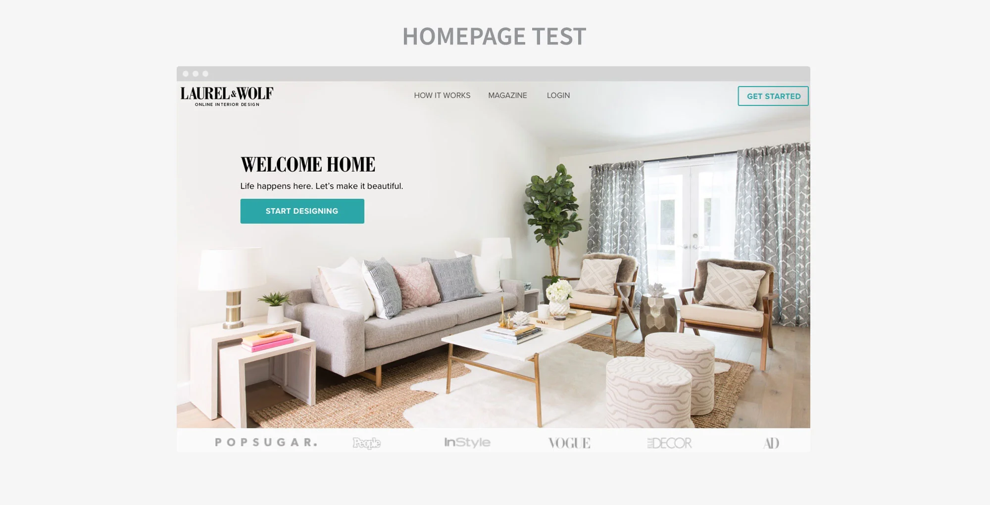
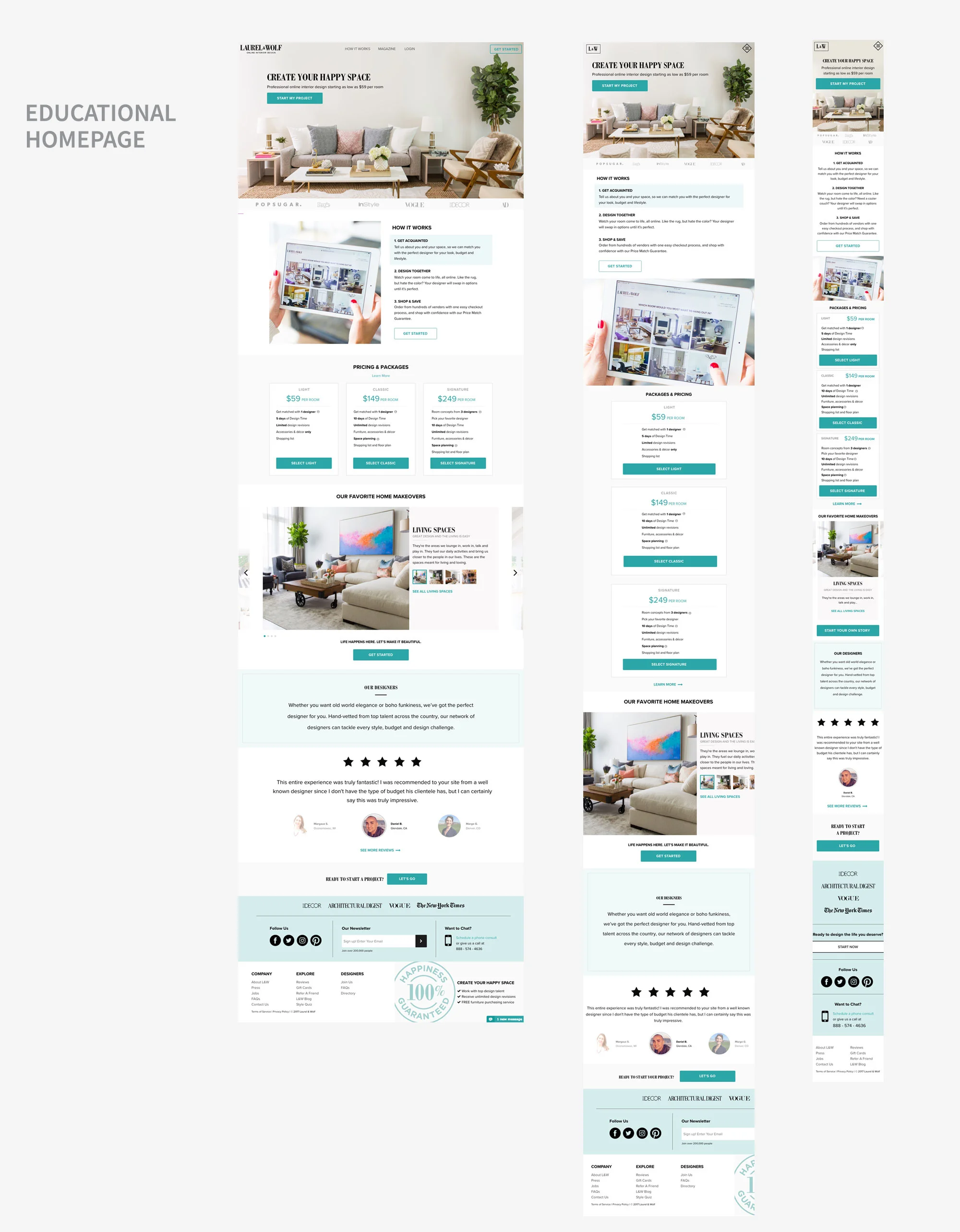
The challenge was to create two new versions of our homepage to test against the current version. The new versions of the homepage would be an aspirational homepage and then an educational homepage. The goal of the aspirational homepage was to showcase a beautiful life for the client to attain, while minimizing a lot of the details (how it works, pricing, etc) that can side track from a gut reaction to using our product. The goal of the educational homepage was to show upfront all the information the client would need to feel confident in using our services. The findings of this test would help us further understand what our client is looking for when they land on our homepage.
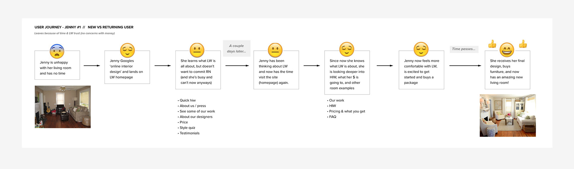
I created an emotional user flow to better understand our clients’ experience with our site and with interior design. This helped me familiarize myself with where our clients’ head will be at when looking at our homepage. From there I came up with some sketches and concepts which turned into paper wires to review with our Product Managers and stakeholders. For the aspirational homepage I wanted to focus more on beautiful photography as a key element to the page. I also wanted to show photographs of relaxed people enjoying their L&W spaces with text to create a more emotional connection. For the educational homepage, we wanted to display all the information the client would need to answer all of their questions. We had our how it works with what you get, our pricing, FAQs, and information about our designers, so that the client wouldn’t have to search for any of the information they needed elsewhere on our site to curb confusion. For both versions we wanted to emphasis that the process is online in a visual way since our clients can get confused. From there I was able to create digital wires in Sketch to then bring up the fidelity further to final comps.